Overview
Koala is a bed mattress e-commerce company based in Australia. The company is relatively young but has grown to be a very successful online business in a short time.
Unlike traditional furniture companies, their online business model that allows easy order and 120 nights free trial have made the business successful not only Australia but recently also in Japan. Focusing only selling online without physical shops helps to keep the pricing competitive.
The Challenge
Japanese websites, especially e-commerce websites tend to be very different than the western sites. In this case, the client website was originally designed for Australian markets.
The client needed help to improve their Japanese e-commerce site and make the user experience more oriented for Japanese customers while keeping the branding.
The Goal
After reviewing the website, there were certain points that stood out and could be improved.
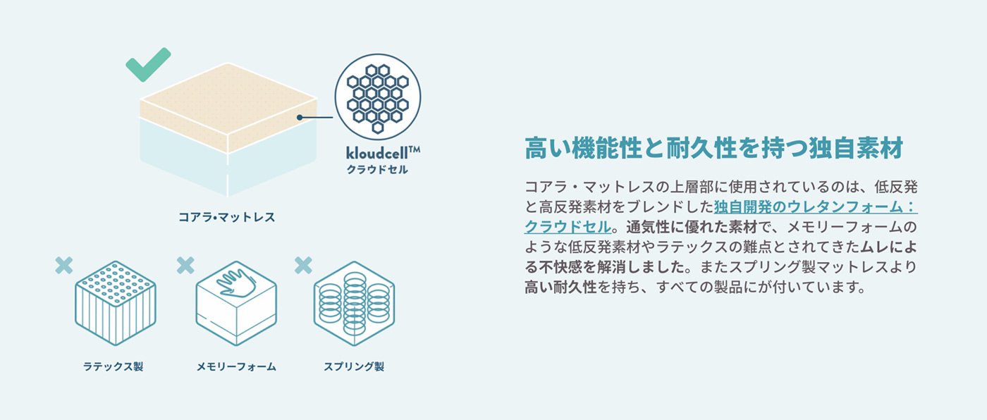
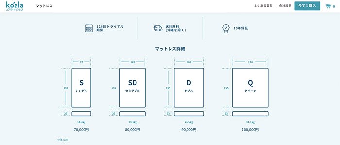
Usually, Japanese customers like to have as many product details and information available. Probably that is why the Japanese websites tend to look very busy to western eye.
Having more information about was one of the goals as well as improving the check out experience and make it more similar to Japanese type of check out experience.
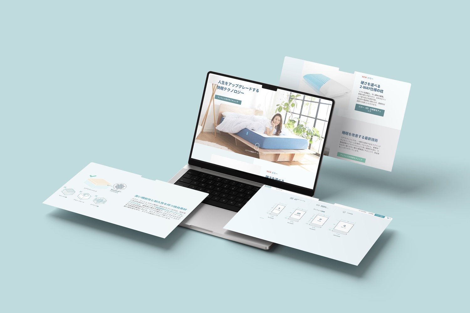
Product page
Having all the information and details easily accessible on the product page was something that required attention.
By visualizing the data using easy to understand infographics helps customer to find out the key factors of the product.
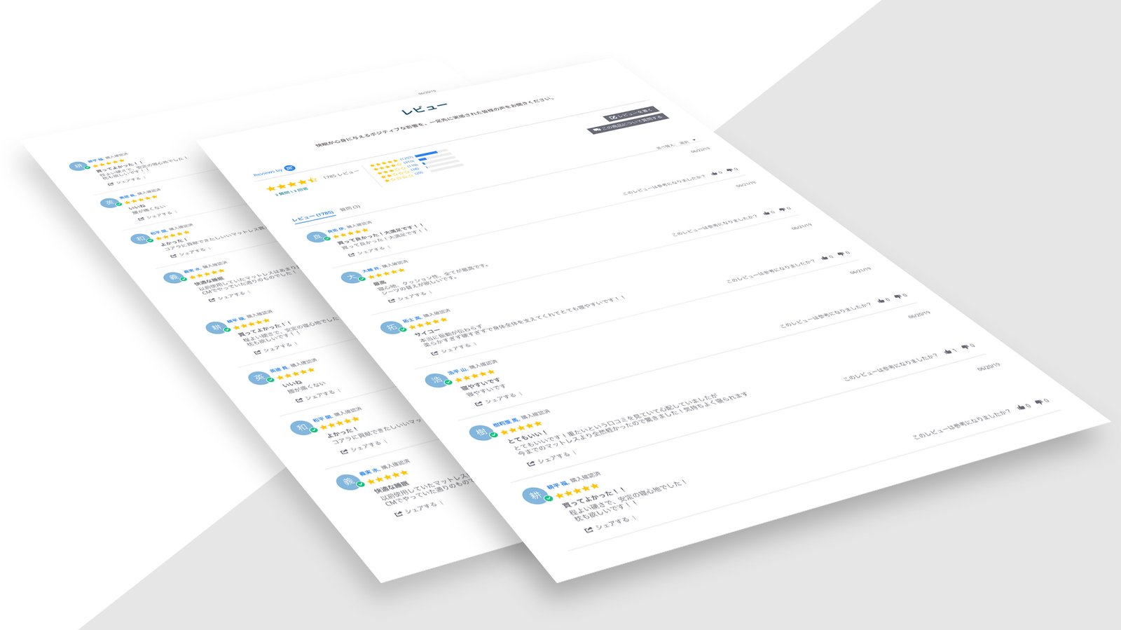
Customer Reviews
When thinking about product page layout and design, the customer reviews should be always easily available for the user.
After viewing the product details, users usually navigate to see product reviews. And that is where conversion often happens.
So not only having the reviews on the product page but also making it easy to customers to submit reviews is very important.
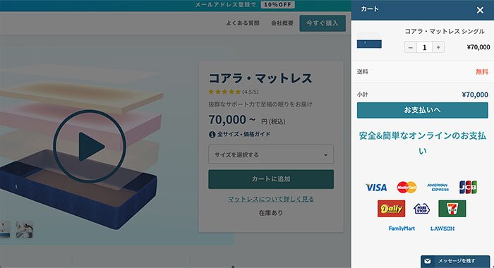
Ordering & Checkout process
When customers are ready to order and check out, it is important to make the process as smooth as possible while reliability and security cannot be overlooked.
At checkout, first-time customers should be able to add all details without extra effort.
Having functions such as address fields filled based on postal codes is becoming a standard on many e-commerce sites.
On Japanese e-commerce sites it is also important to have additional payment options such as convenience store payments available.
Final thoughts
Having a website with a clear path and all the key information presented in sensible segments makes users feel confident and converts them into customers.
Furthermore, understanding what the target audience is looking for and predicting the sequence of each interactions helps us to present the right information in right places.